
Overview
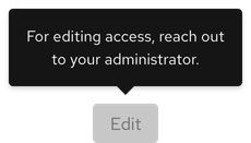
A tooltip is a floating text area that provides helpful or contextual information on hover, focus, or tap.
- Figma library
-
Ready - Responsive
-
Ready - RH Elements
-
Ready - webRH
-
Ready
Sample element
Demos
View a live version of this component and see how it can be customized.
<rh-tooltip>
  <rh-button>Tooltip</rh-button>
  <span slot="content">Lorem ipsum dolor sit amet, consectetur adipiscing elit, sed do eiusmod tempor incididunt ut
    labore et dolore magna aliqua. Mi eget mauris pharetra et ultrices.</span>
</rh-tooltip>

<script type="module">
  import '@rhds/elements/rh-button/rh-button.js';
  import '@rhds/elements/rh-tooltip/rh-tooltip.js';
</script>
<rh-tooltip> demo in a new tabWhen to use
- When users need help making a decision
- When you need to provide more information for icons or icon buttons without labels
- When you need to define new or unfamiliar UI elements that are not described directly in the user interface
Status checklist
| Property | Status | Meaning |
|---|---|---|
| Figma library |
|
Component is available in the Figma library |
| Responsive |
|
Component responds to changing viewport sizes in Figma and the browser |
| RH Elements |
|
Component is available as a web component |
| webRH |
|
Component is available as a web component |
Related elements or patterns
Feedback
To give feedback about anything on this page, contact us.
Red Hat legal and privacy links
- About Red Hat
- Jobs
- Events
- Locations
- Contact Red Hat
- Red Hat Blog
- Diversity, equity, and inclusion
- Cool Stuff Store
- Red Hat Summit
Red Hat legal and privacy links

